In today’s fast-paced digital world, the demand for clean, efficient, and visually appealing websites has led to the rise of minimal web design.
This design approach is not just a passing trend; it has become a staple in modern web design, offering a sense of simplicity, elegance, and sophistication.
In this article, we will explore the key elements of minimalist web design, its benefits, and why you should consider this approach for your next website project.
Table of Contents
What is Minimal Web Design?
Minimal web design refers to a design style that focuses on simplicity, utilizing only the essential elements to create a clean and uncluttered visual experience. It emphasizes the importance of white space (or negative space), which is the space around design elements that allows them to breathe and stand out.
This design style often features a limited color palette, with popular choices being monochrome color schemes like black, white, or shades of gray.
Minimalist websites are characterized by their minimalist aesthetic, which often includes bold typography, simple and spacious layouts, and a focus on high-quality images.
The use of solid backgrounds like a black background, white background, or even a blue background helps create a sense of balance and ensures that the content remains the focal point.
The Principles of Minimal Web Design
- Simplicity: The foundation of minimalist design principles is simplicity. This means removing unnecessary elements that do not contribute to the overall user experience. A minimalist site design typically avoids excessive decorative elements, ensuring that the focus remains on the content.
- White Space: Also known as negative space, white space plays a crucial role in minimalistic design. It enhances the readability of content and creates a more pleasant user experience by reducing visual clutter.
- Visual Hierarchy: A key aspect of minimal web design is the use of visual hierarchy. By strategically placing elements on the page, such as using bold typography for headings and smaller fonts for body text, designers can guide users’ attention to the most important content.
- Limited Color Palette: Minimalist web designs often feature a simple color palette, typically using one or two primary colors, such as a monochromatic color palette with black typography on a white background. This design aesthetic helps create a cohesive and visually appealing experience.
- High-Quality Images: Instead of using multiple images, minimalist sites focus on a few stunning images that are strategically placed. An image slider can also be used to showcase additional images without overwhelming the user.
- Fluid Layouts: A minimalist layout should be responsive and adaptable to different screen sizes. Compatibility between screen sizes is essential to ensure a consistent user experience across devices.
- Simple Navigation: The navigation bar in a minimalist website design is usually straightforward, with kebab menus or Hamburger menus that keep the navigation clean and unobtrusive.
Why Choose Minimal Web Design?
- Enhanced User Experience: The clean and uncluttered nature of minimalist websites creates a more pleasant and intuitive user experience. Users can easily find the information they need without being distracted by unnecessary elements.
- Faster Load Times: With fewer visual elements and a simple design, minimalist websites tend to load faster, which is crucial for user retention and SEO performance.
- Lower Design Costs: A minimalist approach to web design can reduce design costs by focusing on essential elements rather than complex graphics and animations. Tools like the Design Cost Calculator or Instant Estimate can help you determine the cost savings of a minimalist web design.
- Timeless Appeal: The minimalistic design has a timeless appeal that can withstand changing design trends. A minimalist site design will likely remain relevant and visually appealing for years to come.
- Versatility: Minimalist web design is versatile and can be applied to various types of websites, including portfolio websites, e-commerce sites, and corporate sites. Whether you’re a creative agency like Bionic Egg Design or a small business, this design approach can be tailored to suit your needs.
Examples of Minimalist Web Design
To inspire your next project, here are some minimalist web design examples that showcase the power of simplicity:
- Studio Yoke: Known for its clean website design, Studio Yoke embraces aesthetic minimalism with its use of simple typography design, monochromatic color palette, and minimalist layout. The site’s visual appeal is further enhanced by the use of geometric shapes and a grid-shaped geometrical pattern.
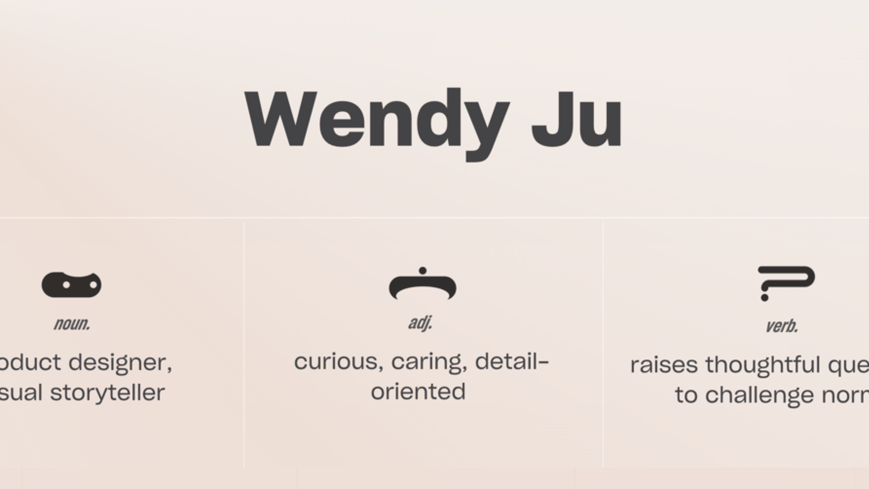
- Wendy Ju: Wendy Ju’s portfolio is a perfect example of a minimalist website design. With a focus on high-quality images and a simple layout, her site exudes a sense of elegance that is both professional and approachable.
- Bionic Egg Design: This creative agency takes a next-level approach to minimalist web design with its use of interactive design elements and flat design. The site features a dark background with bold typography, creating a striking visual contrast that draws the user in.

Elevate Your Online Presence with Minimal Web Design
Minimal web design is more than just a trend—it’s a powerful design style that offers a sense of simplicity and elegance that can elevate your online presence. By focusing on essential elements, such as white space, visual hierarchy, and a limited color palette, you can create a website that is both visually appealing and highly functional.
If you’re ready to take your website to the next level with a minimalist approach, contact me today for a custom web design that reflects your brand’s unique identity. Let’s work together to create a minimalist website design that not only looks great but also delivers an exceptional user experience. Use the Design Cost Calculator or request an instant quote to get started on your project.
Transform your digital presence with a minimalistic web design that stands out in today’s crowded online landscape. Reach out now to discuss your project and see how we can create a simple, elegant, and effective website tailored to your needs.
Minimal Web Design FAQ
What is minimal web design and what makes up a minimal web design?
Minimal web design is a design style focused on simplicity, using only essential visual elements. It often includes a lot of white space, a limited color palette, and a clean, uncluttered layout to create a pleasant user experience.
Why is white space important in minimalist design?
White space, or negative space, is crucial in minimalist design as it helps separate elements on the page, making the content easier to read and enhancing the overall visual hierarchy.
What are the benefits of using a limited color palette in minimalist websites?
A limited color palette, such as a monochromatic color scheme, simplifies the design, creating a cohesive and elegant look. It also reduces visual distractions, allowing users to focus on the content.
How does minimal web design affect design costs?
Minimal web design can reduce design costs by focusing on essential elements and avoiding unnecessary complexity. Tools like the Design Cost Calculator can help estimate potential savings.
Can minimalist websites be customized?
Yes, minimalist websites can be fully customized to reflect a brand’s identity while maintaining a simple and clean aesthetic. This includes choices in typography, color schemes, and visual elements.
What is the role of navigation in minimalist web design?
Navigation in minimalist web design is straightforward and unobtrusive, often using simple menus like kebab or Hamburger menus. This ensures that users can easily find what they need without cluttering the design.
Are there any good examples of minimalist web design?
Yes, examples like Studio Yoke and Wendy Ju showcase minimalist web design principles with clean layouts, bold typography, and a sense of elegance that defines the minimalist aesthetic.
How does minimalist web design enhance user experience?
Minimalist web design enhances user experience by reducing clutter, improving readability through effective use of white space, and focusing on high-quality images and essential content elements.
What types of businesses benefit from a minimalist design approach?
Businesses like creative agencies, portfolio websites, and service-based businesses benefit greatly from a minimalist design approach, as it highlights their offerings without overwhelming the user.
How can I get started with a minimalist web design for my business?
To get started with a minimalist web design, contact a design agency that specializes in this style. Use the Design Cost Calculator to estimate your project’s cost or request an instant quote to see how a minimalist approach can elevate your online presence.
